
Media General, an 100+ year old company, was looking to update its logo to something more modern while honoring its rich legacy. They selected 5 design teams to participate in the redesign process from their large network of local T.V. properties–and my team–that led design for all of their digital properties. My approach was to take inspiration from the company's original logo, and color and typography references from the heyday of the newspaper era (1900's-1940's). At the same time, I wanted to embrace the company's future in digital media, creating a mark that was digital-first, and could also be successful across broadcast, print and digital. Our logo was selected as the winner.
Results
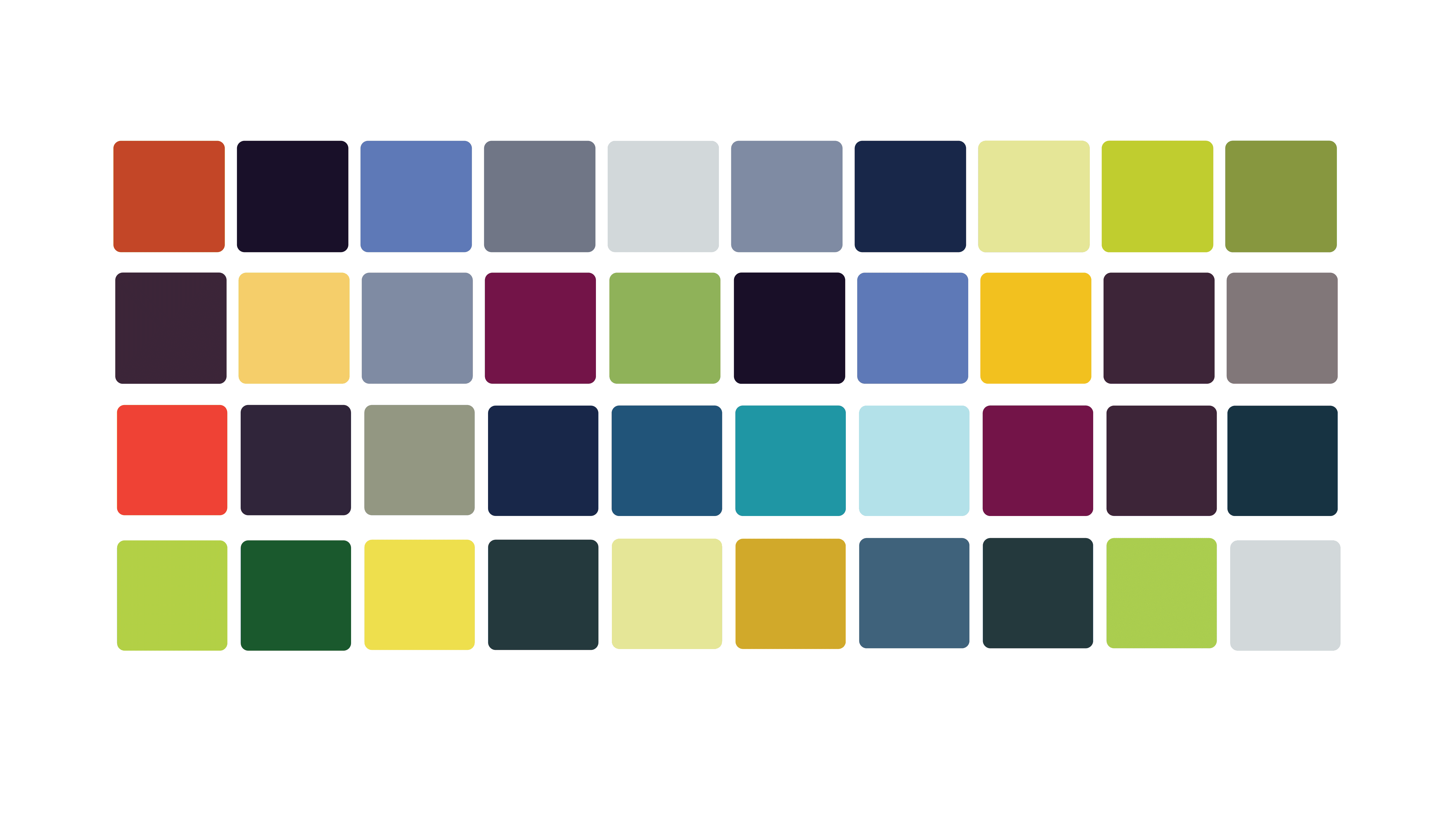
The updated logo incorporated the muted Victorian palette using Brandon Grotesque, a font inspired by 1920's & 30's typefaces. To be more modern, the new wordmark was all lowercase, combined with 3 honeycombs, symbolizing the company's legacy as a newspaper business, its current status as a leading regional television station owner, and its future as a digital media corporation.
Creative direction: Cara Phillips
Graphic design: Emily Eck & Kelsey Singleton
Typeface: Hannes von Döhre


Previous
Next