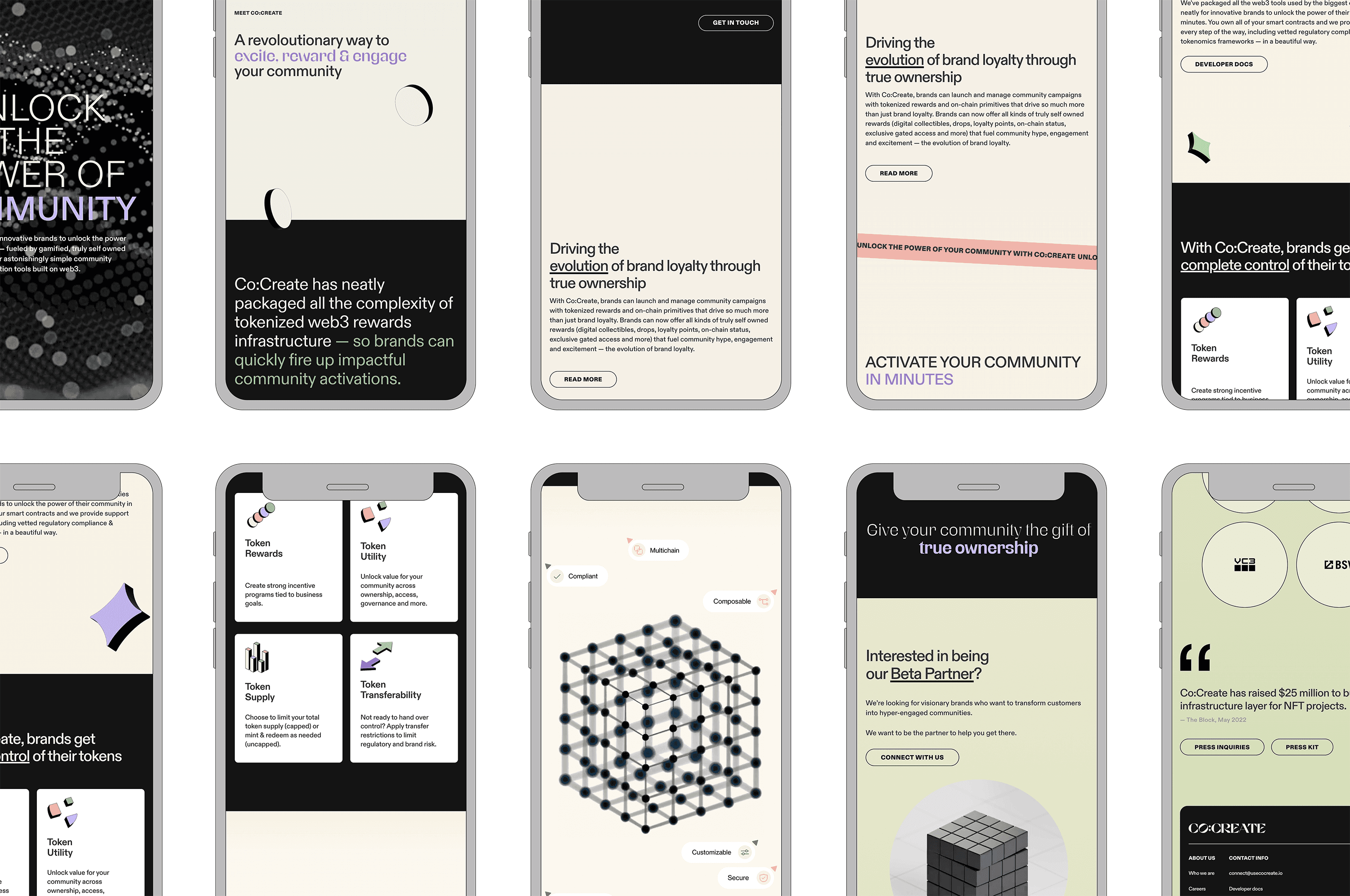
Partnering directly with the founders, my first project was to create a winning pitch deck to raise their seed round. After securing 25M we had 8 weeks to be live in-market. I identified and vetted agency partners who could meet the time & budget constraints for company naming & PR launch.
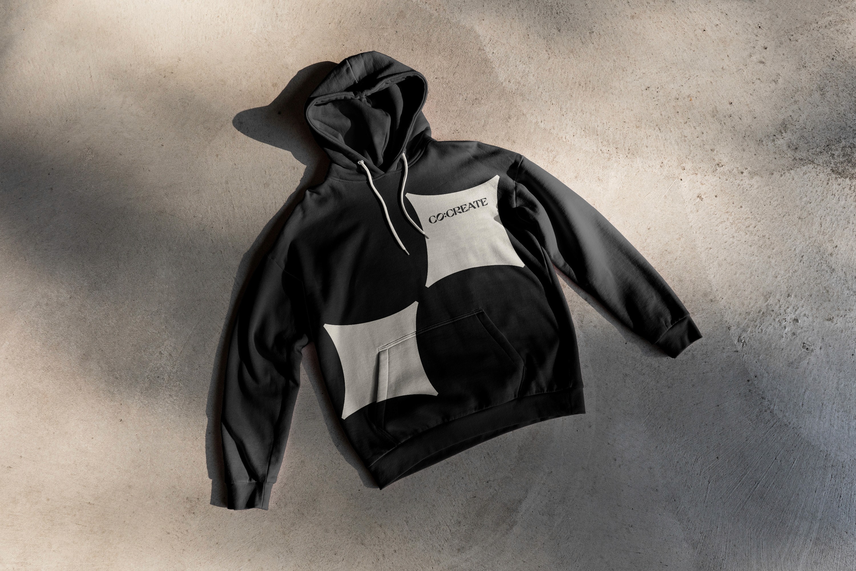
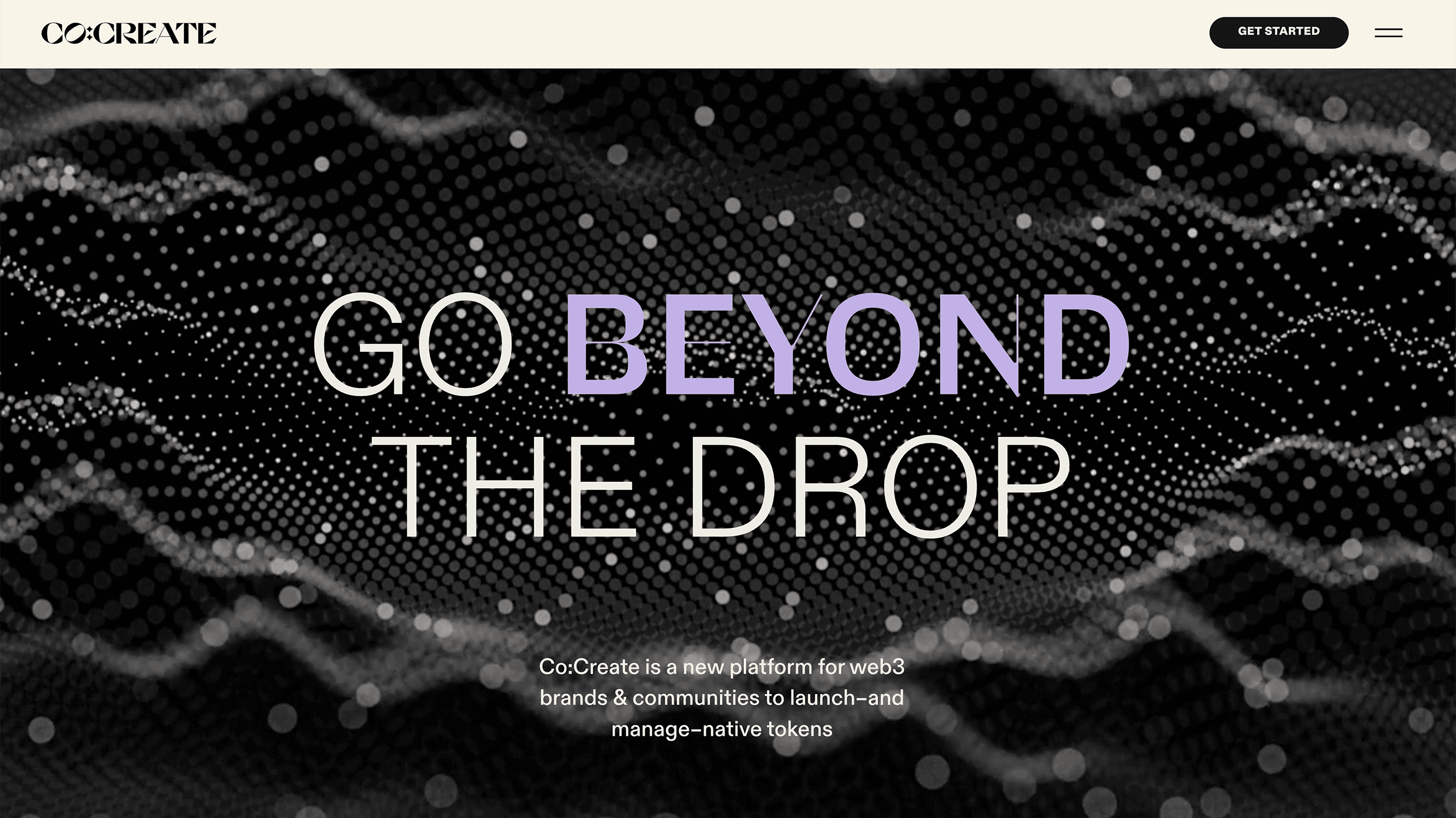
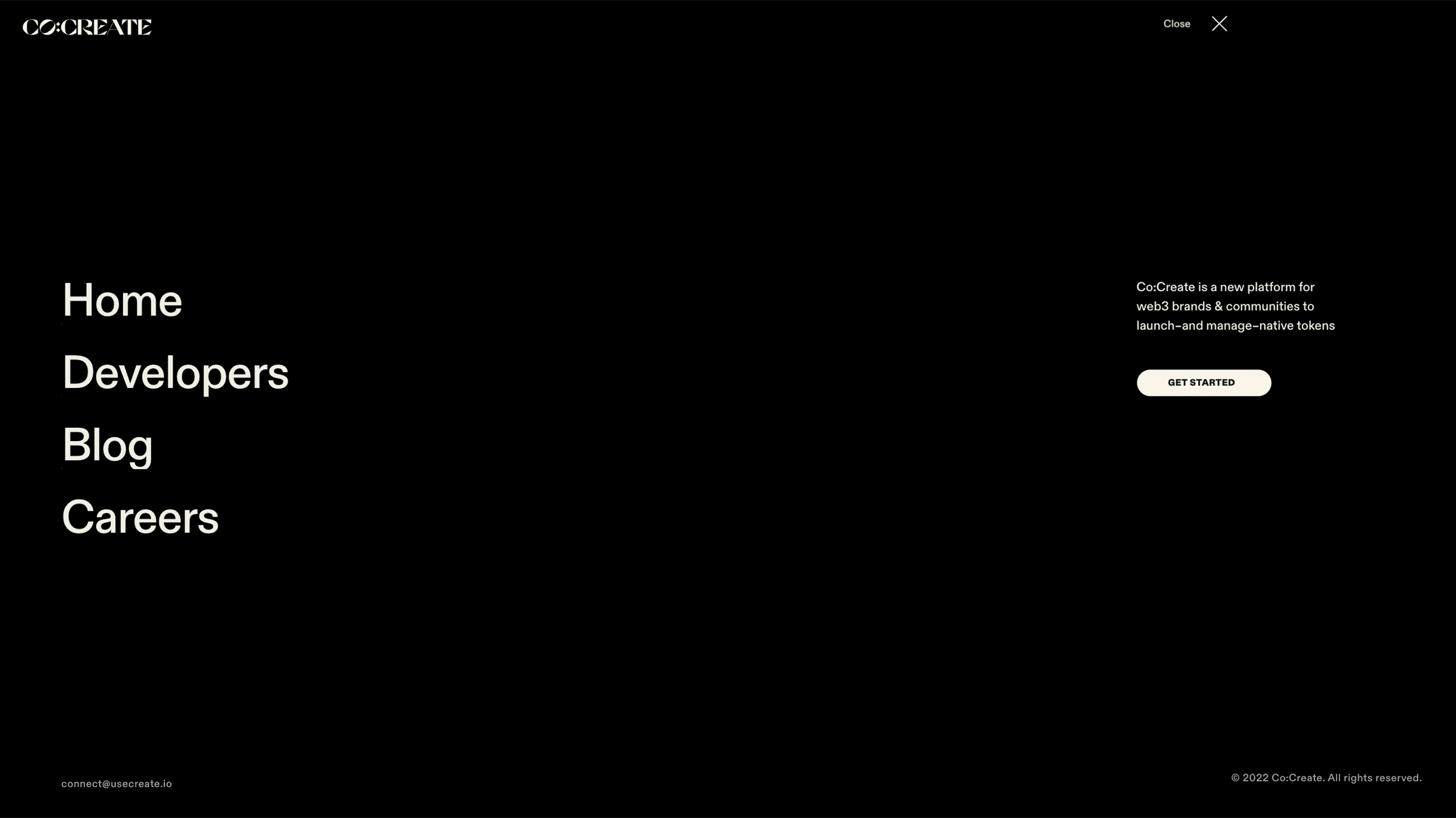
My design approach included commissioning a 3-D type artist to create a temporary mark, and developing a black & white brand system with simple 3-D shapes and motion to reference the company's focus on supporting NFT creators. For the launch, I delivered a landing page & created assets for social to generate excitement as we continued to develop the full brand ecosystem.
Results
25M in seed funding
Over 10 earned media mentions in top crypto & tech publication
1000+ Twitter followers within first month
Creative direction, strategy, graphic design & copy: Cara Phillips
Web design: Victoria Siemer
3-D assets: Rob Morrisette
Logo: Daniel Escudeiro
Naming: A Hundred Monkeys
Marketing & PR: Serotonin


After doing a competitive analysis, it was clear that the web3 market was oversaturated with a “sea of sameness.” I wanted Co:Create to stand out, but with web3 developers & creators as core customers the brand needed to appeal to them. To differentiate from predominant look in the space, I used an editorial and typography forward visual identity to position the company as a premium web3 protocol. To connect it to the look of web3, I chose black as the core brand color–and commissioned original NFTs for the brand. It was also crucial for the brand voice to speak to multiple audiences. I worked with the CEO to write copy that was accessible, while also including enough technical detail to gain the trust of the more sophisticated clients.
Within 6-months the NFT market had shifted dramatically and the product needed to pivot. I identified an agency that could work within our budget and refined our logo and updated our website to reflect the product’s evolution.
Creative direction, strategy, graphic design, copy: Cara Phillips
Graphic design: Christine Lee
Product design: Paula Moody
Illustrations: Rob Morrisette
Web Development: Serotonin
NFT art: ARC
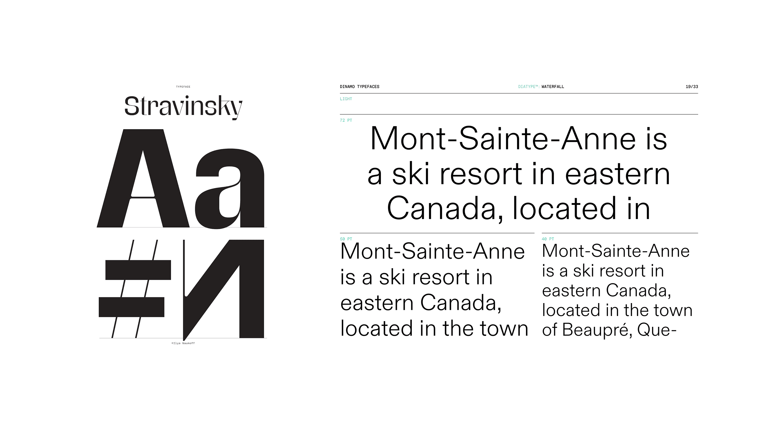
Typefaces: Futurefonts; Dinamo
Website update & logo: ONDA Studio


Previous